Brand Introduction
Medha Dairy is a Jharkhand Milk Federation brand. JMF managed by National Dairy Development Board (NDDB) and a subsidiary of Mother Dairy.
Summary
Cravants undertook the project through a public tender floated in the newspaper in November 2016 for ‘Rebranding of Medha’ after due process.
Problem Statement/Objective
Key challenges that Medha Dairy faced included an image crisis because of quality issues, intense competition from other brands with more sales and booths, poor branding with basic packaging and operational challenges like late delivery.
Brief
To create a new brand identity for Medha Dairy and help the brand reach consumers.
Creative Idea
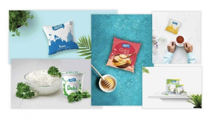
The blue colour of the logo was maintained and a drop of milk was added to the design. This helped add a sense of freshness and purity to the brand identity. In terms of packaging, elements associated with the state of Jharkhand were added. From shop boards to booth structures to milk transportation vehicles, everything was redesigned.
Challenges
The initial logo had legibility and readability issues with poor curves and an unnecessary ribbon. Solving these issues was key to the whole process.
Execution
A five-step process was followed:
Identity Design: Reimagining and redesigning the brand identity — logo, fonts, colours and brand bible.
Packaging Design: Design the packaging to give it a modern yet a very local feel.
Brand Infrastructure: All the booths and retailers, website, social media accounts needed to be concurrent with a renewed brand identity.
Launch: The rebranded identity was launched in April 2018 at Radisson in Ranchi.
Marketing Campaigns: People were made aware of the new brand promises, efforts were put in to strengthen sales.
Results
Medha is slowly becoming a household name in Jharkhand, while in 2017 it had low popularity. The sales figure rose from 71,000 litres per day to 1,30,000 litres per day within the seven months of campaigning.
Medha Dairy Rebranding Case Study from Social Samosa
comments
